
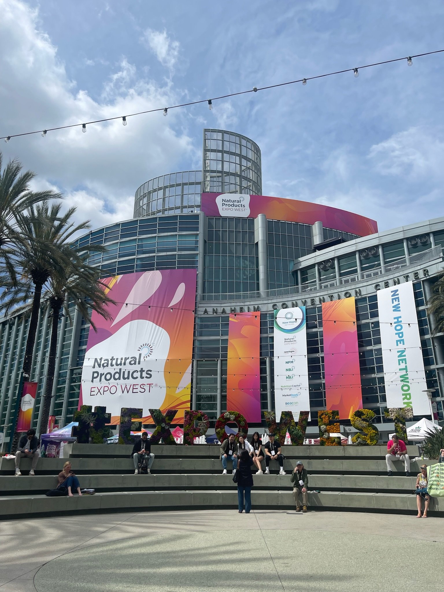
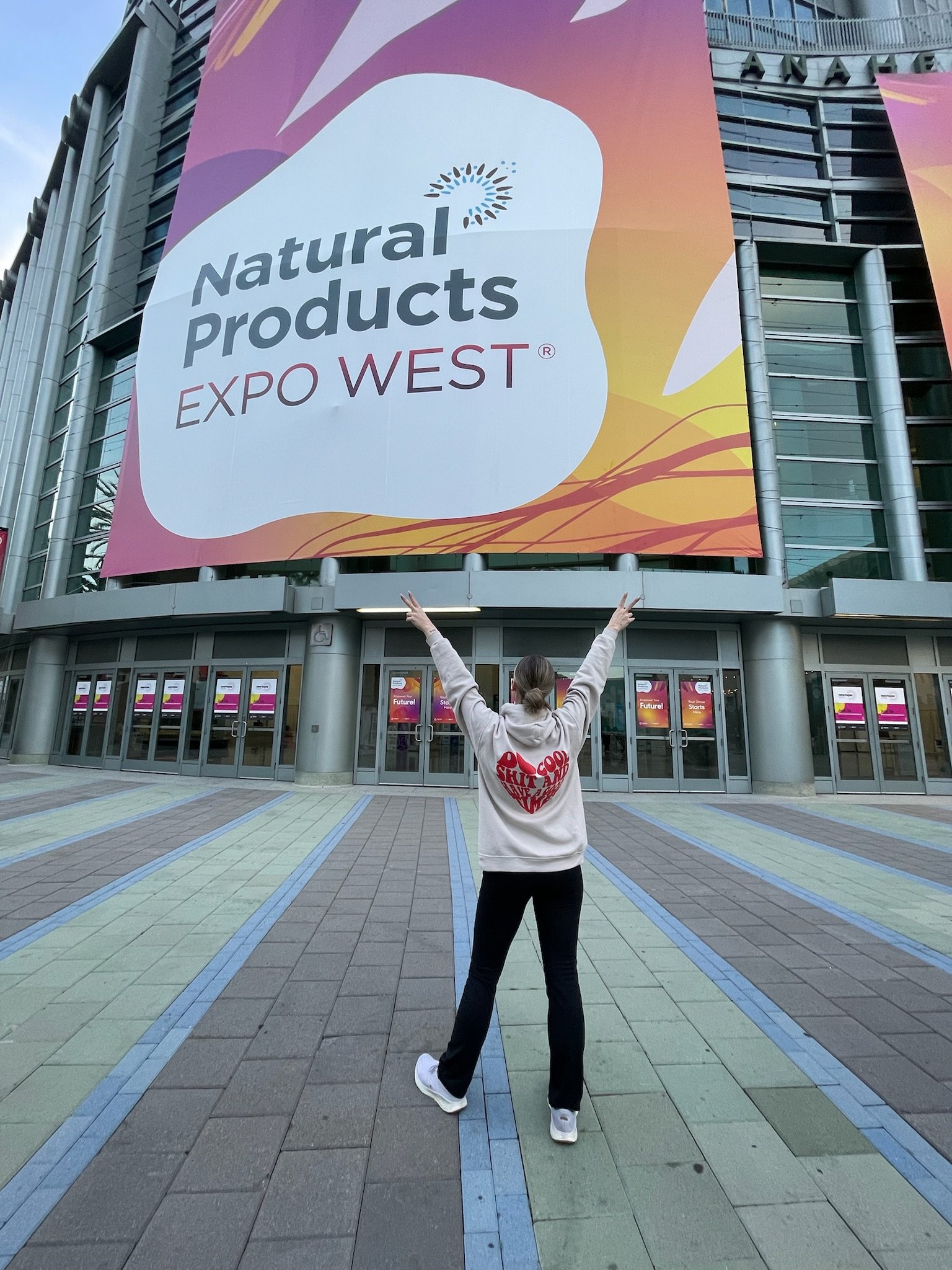
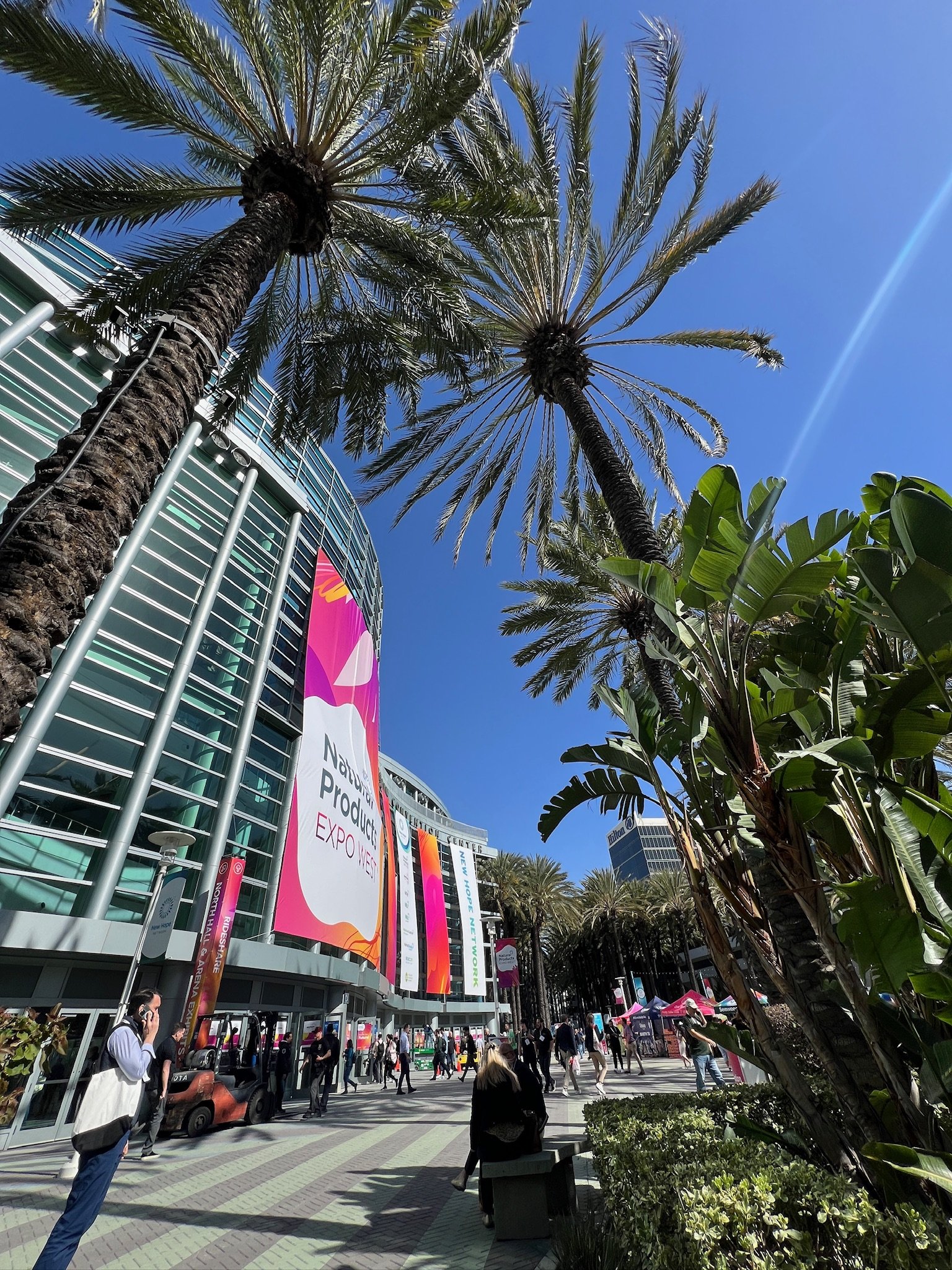
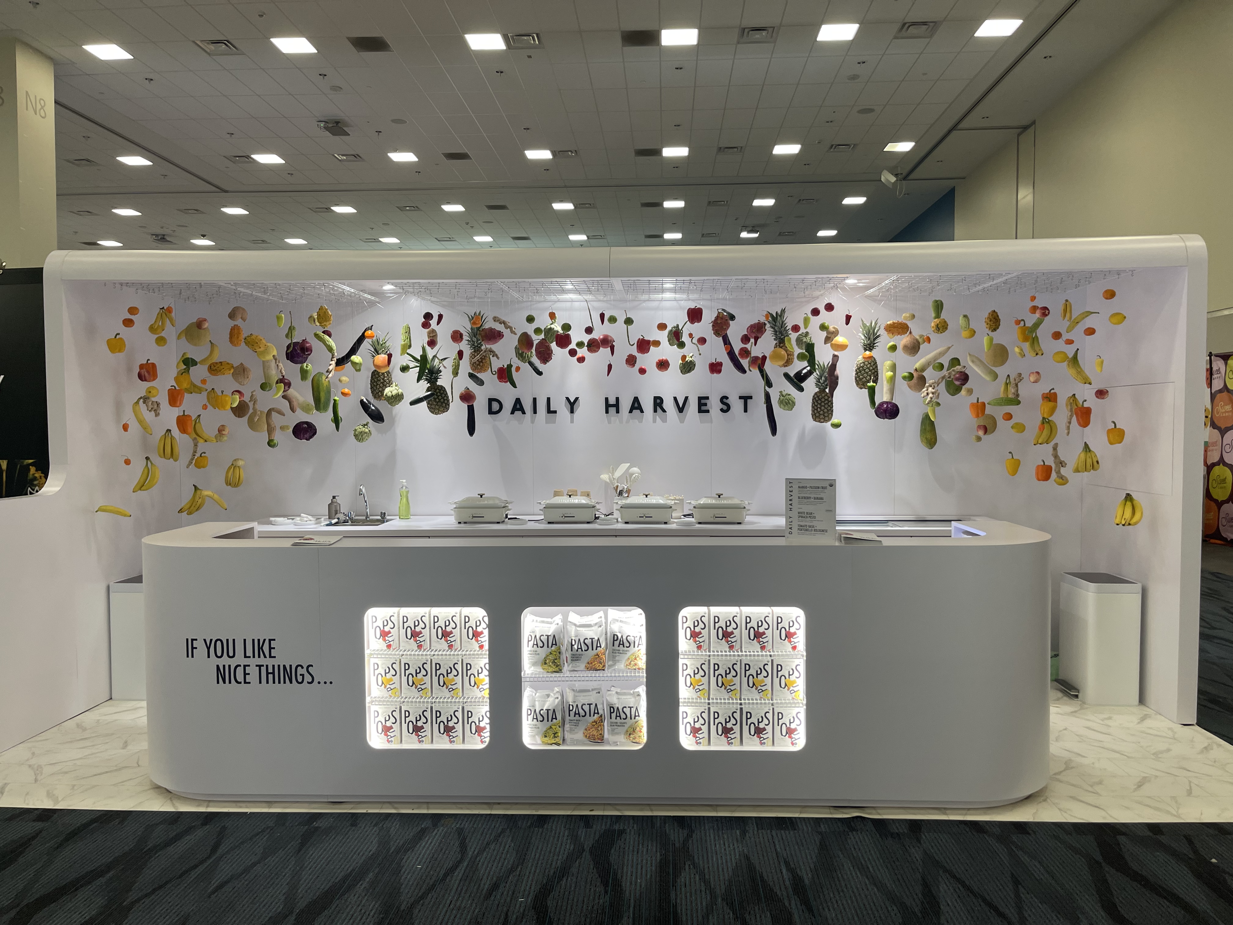
DESIGN TRENDS AS SEEN AT NATURAL PRODUCTS EXPO WEST
In this post, we're taking you behind the scenes of Expo West and breaking down the design trends that had everyone at Good Time Creative talking. From the materials and finishes that set booths apart to the clever use of graphics and color, we're uncovering the secrets behind standout displays. Plus, find out what booths were the GTC crew favs!
Materials & Finishes
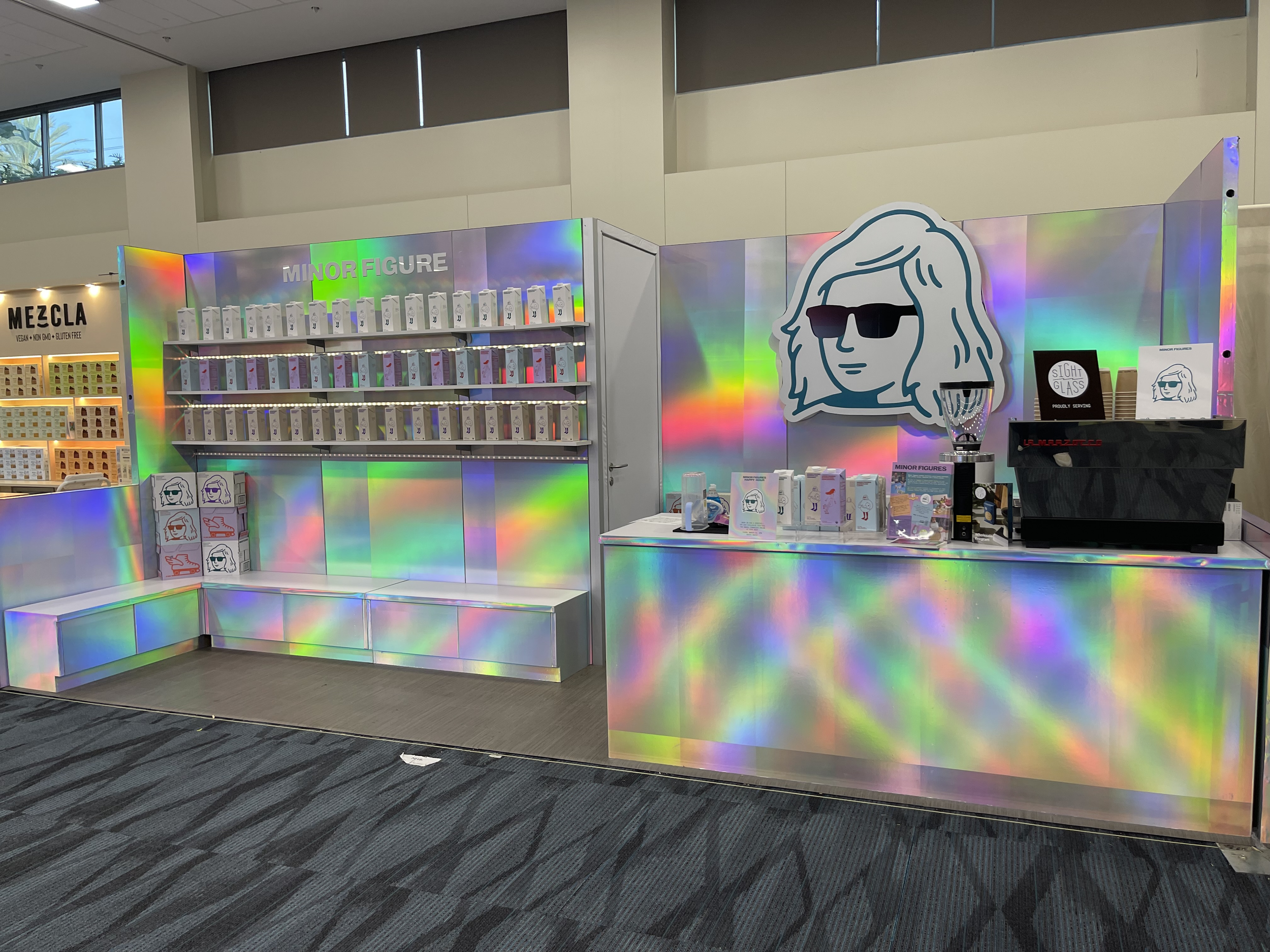
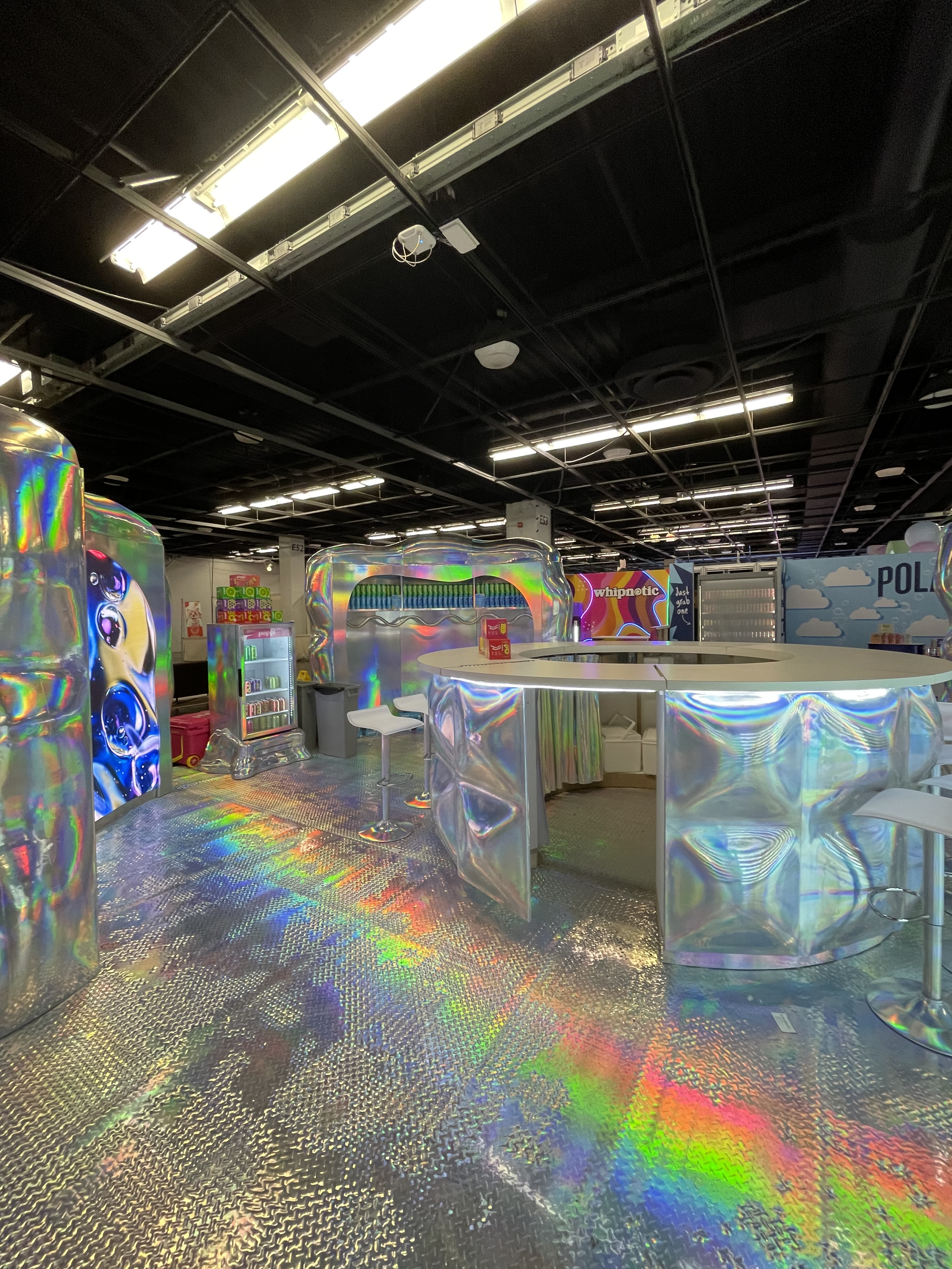
Expo West unveiled a lineup of booth designs that screamed boldness and innovation, driven by their standout materials and finishes. Iridescent finishes took the spotlight, featured in booths like Poppi and Minor Figure.
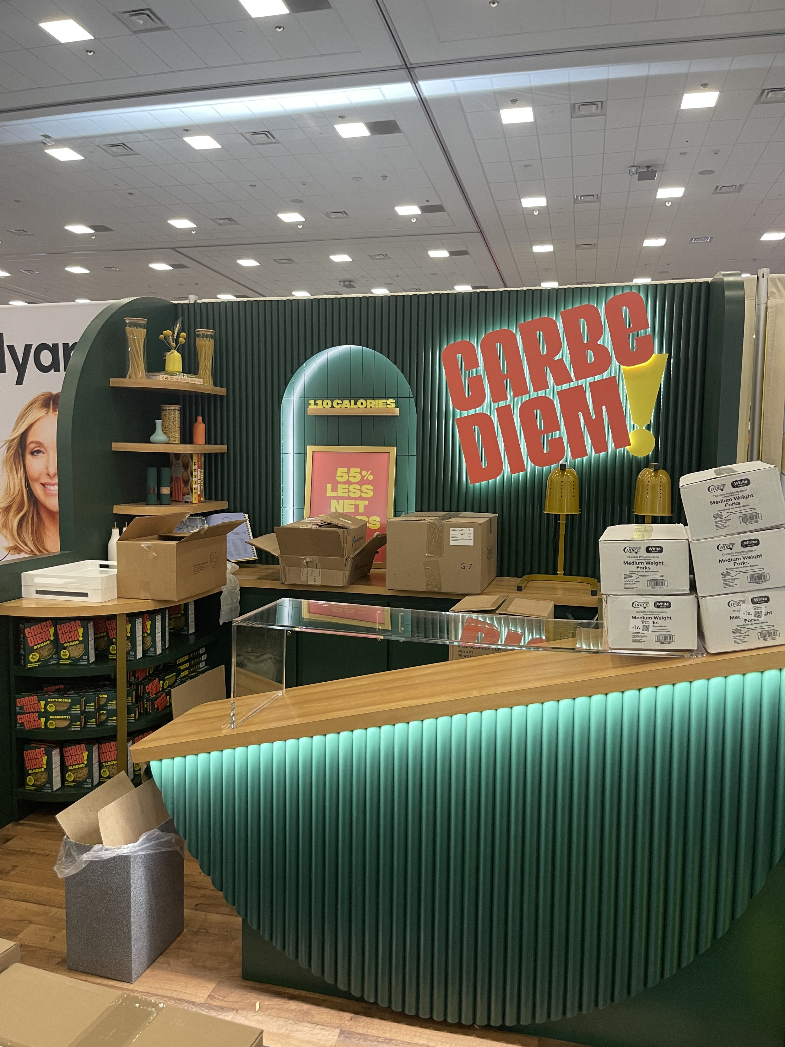
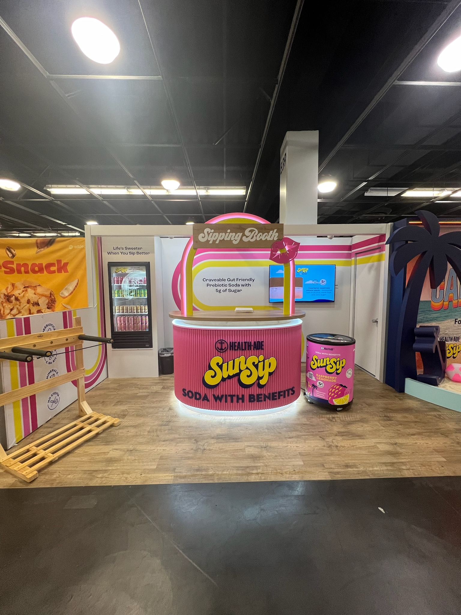
Natural wood elements dominated the scene, bringing an earthy yet rugged vibe to the exhibit. Slat wood details made a strong statement across the expo hall. Fluted finishes injected playful energy into counters and back walls of booths such as Sun Sip and Carbe Diem.

Flooring is next on the list, with checkered patterns again stealing the show. GTC’s very own client Rambler used checkered flooring to enhance their dive bar aesthetic booth.
Graphics & Color
The show floor at Expo West was a vibrant tapestry of bold colors, pastels, color blocking, and comic graphics that demanded attention from every attendee.

Punchy, multi-color booths, like Mavericks, were a big hit and stood out among the pack.
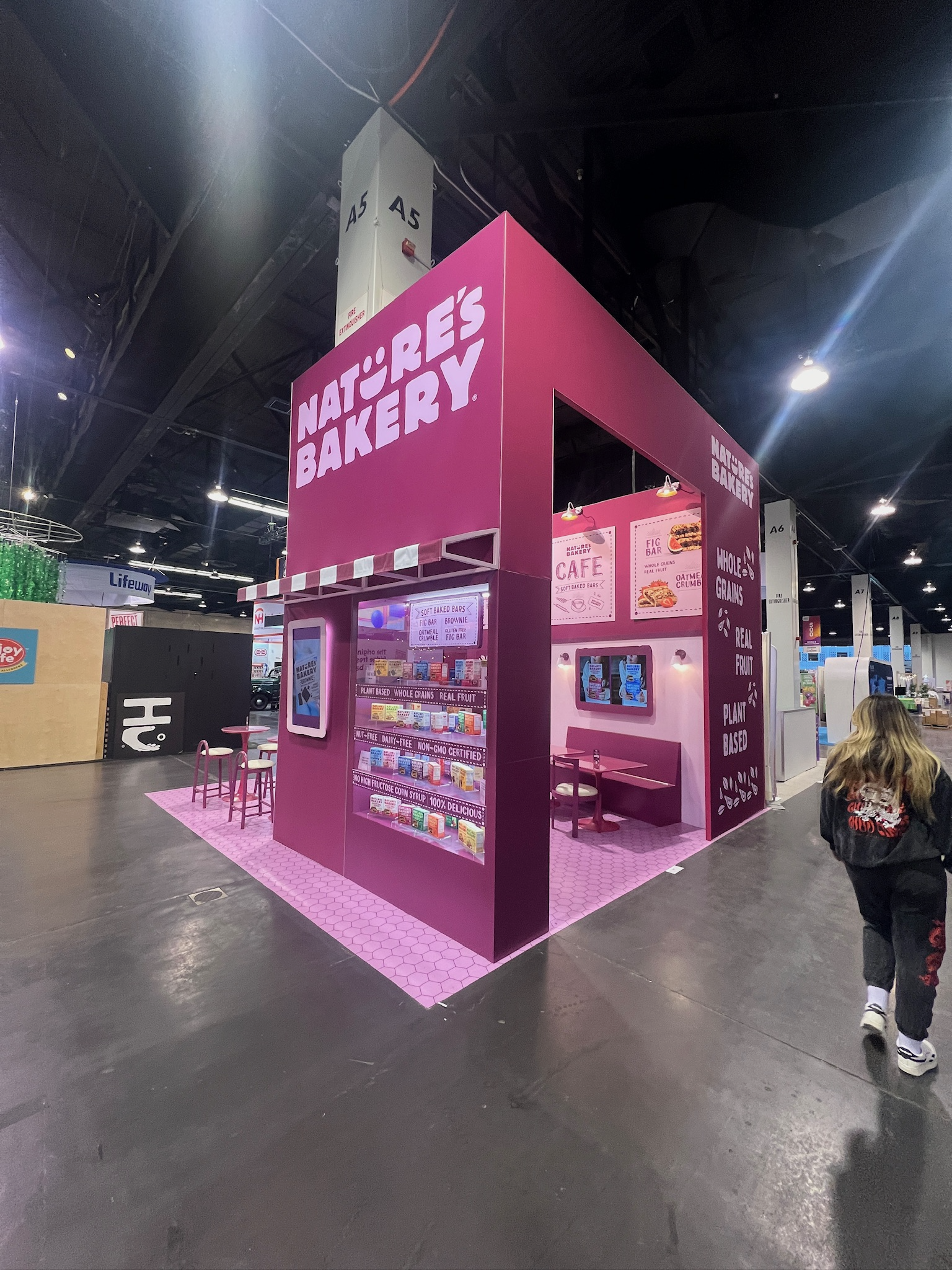
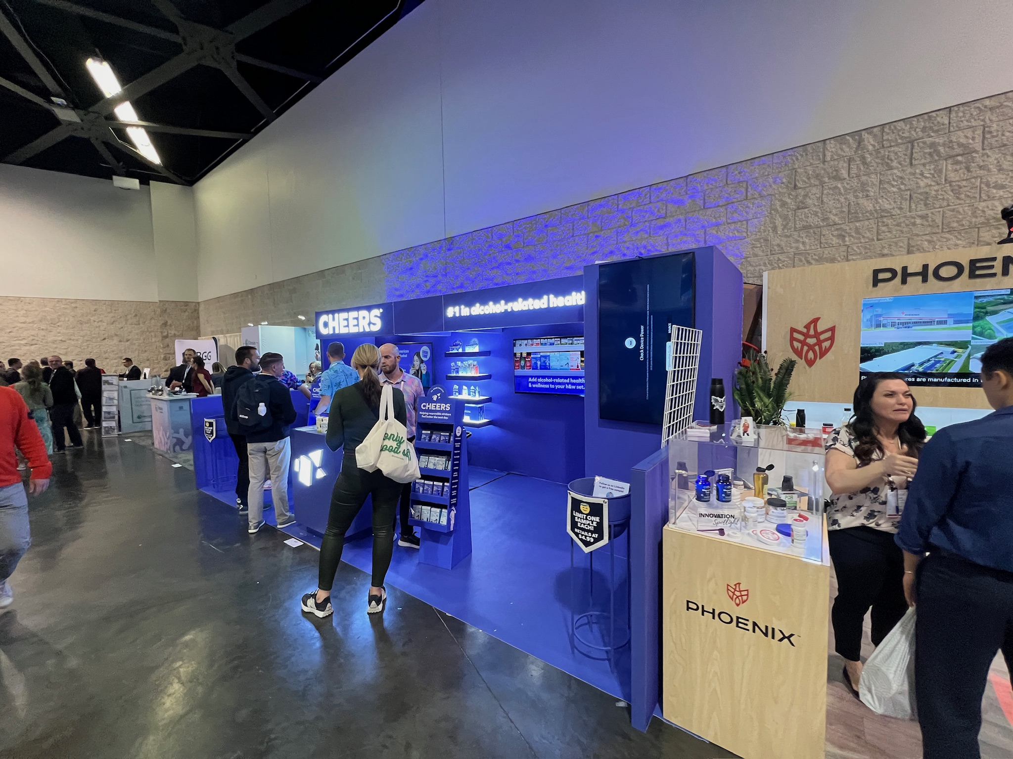
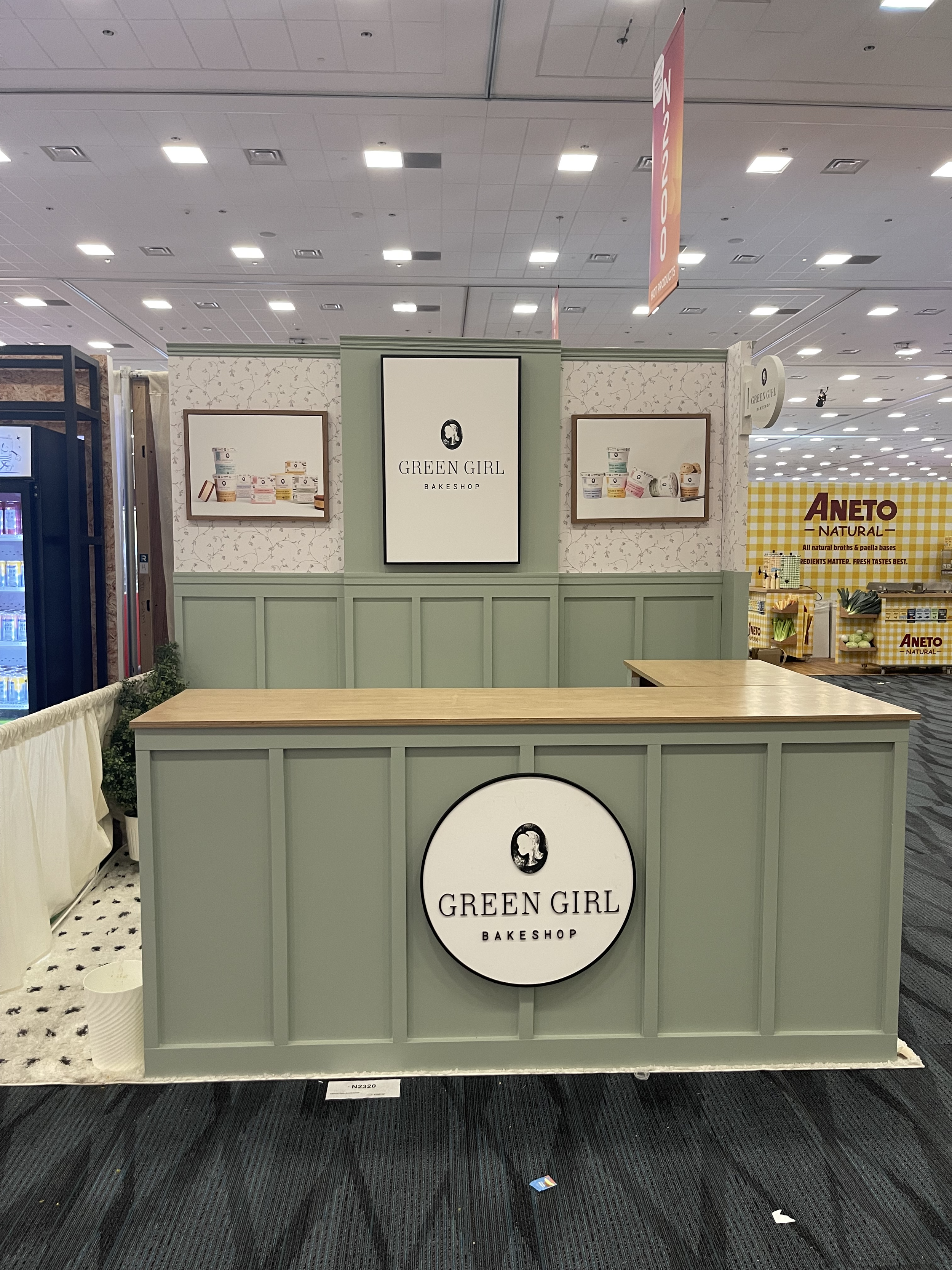
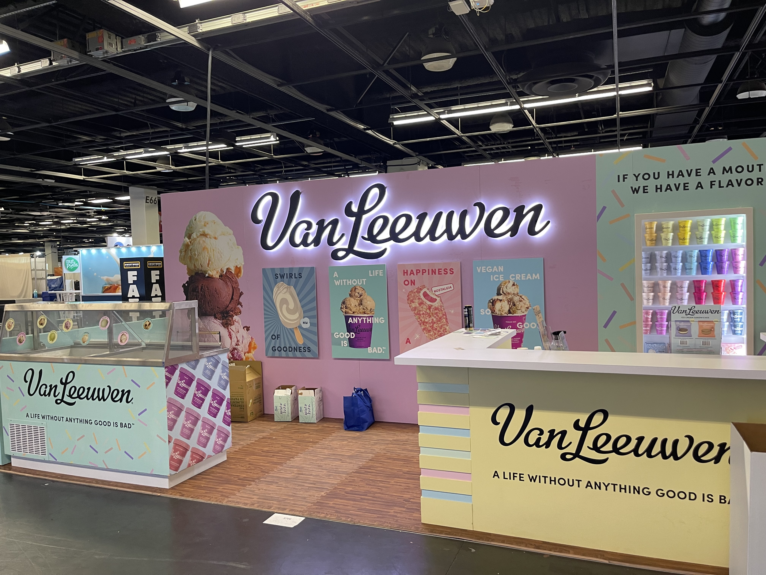
Nature’s Bakery and Cheers opted for a monochromatic approach, exuding a bold yet uniform vibe. Meanwhile, Van Leeuwen and Green Girl set a serene tone with their dreamy pastel palettes.
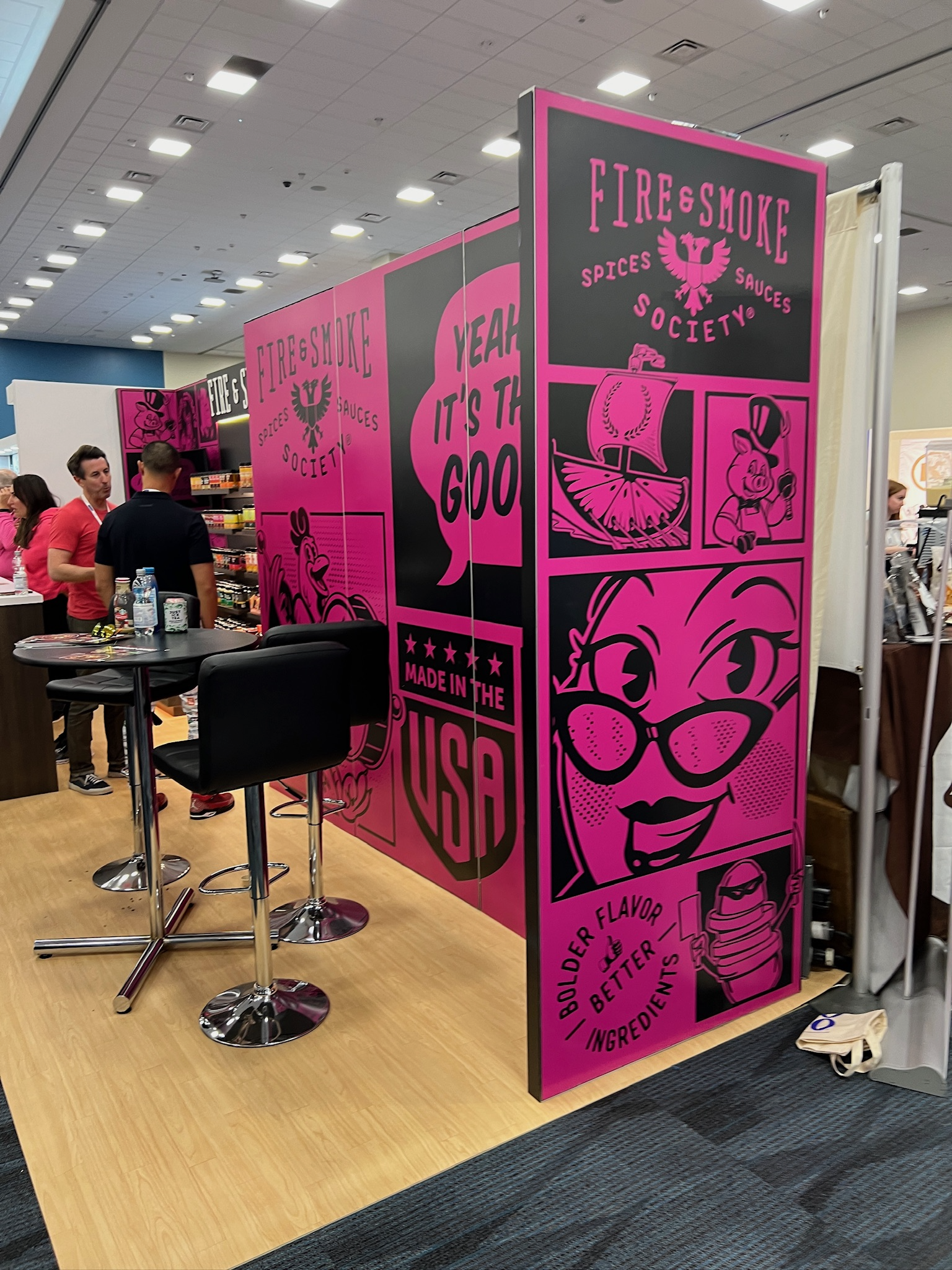
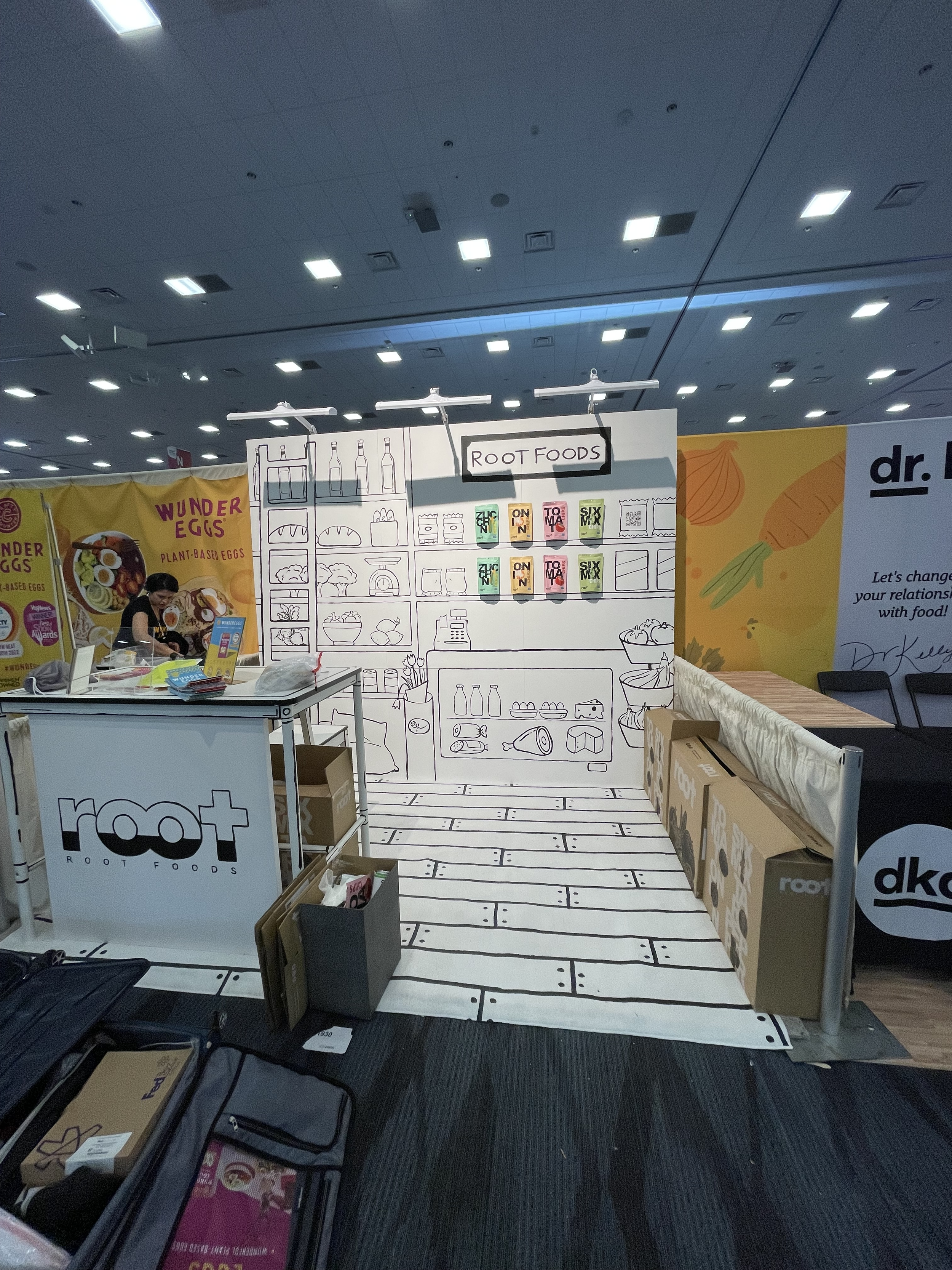
Comic graphics emerged as a powerful storytelling tool, with Fire and Smoke and Root Foods mastering the art of narrative through visuals.
Lighting
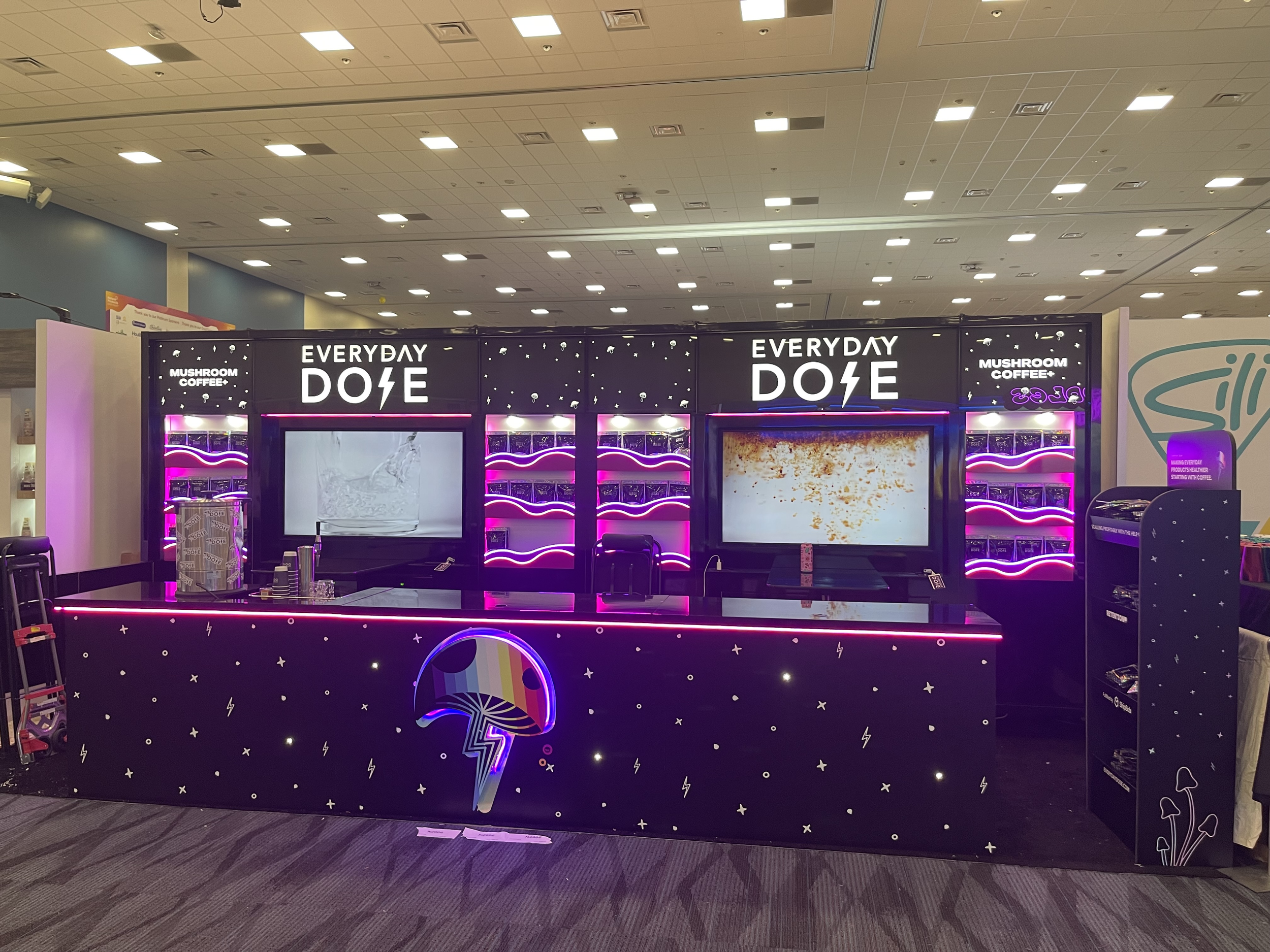
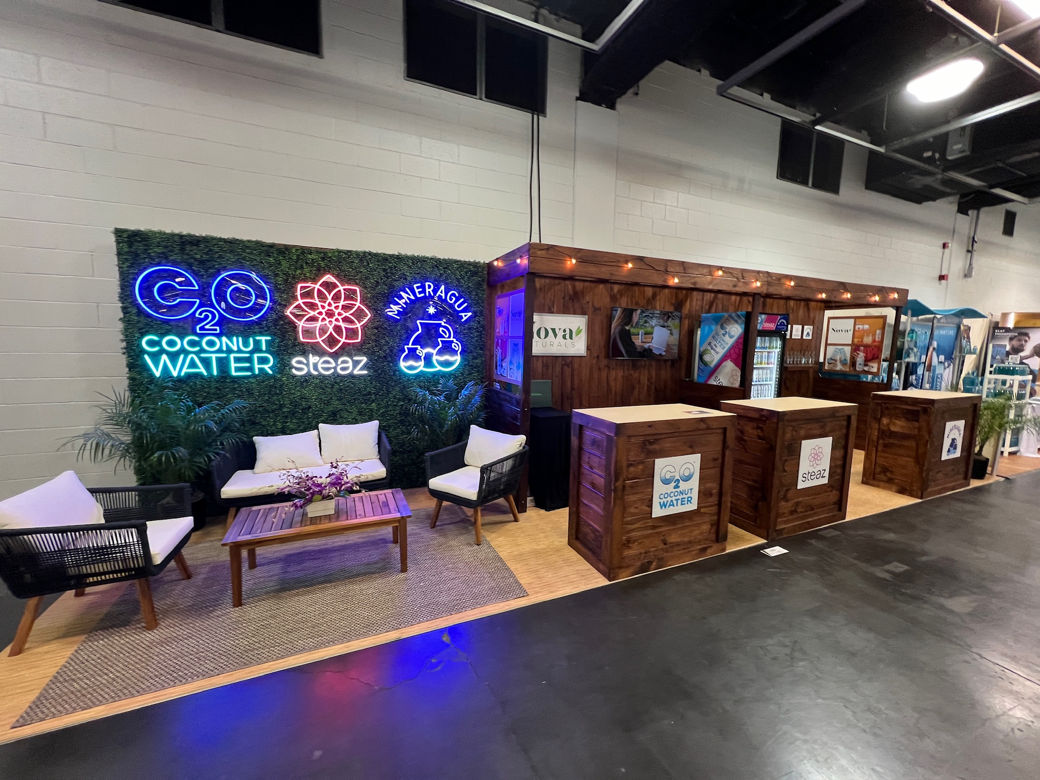
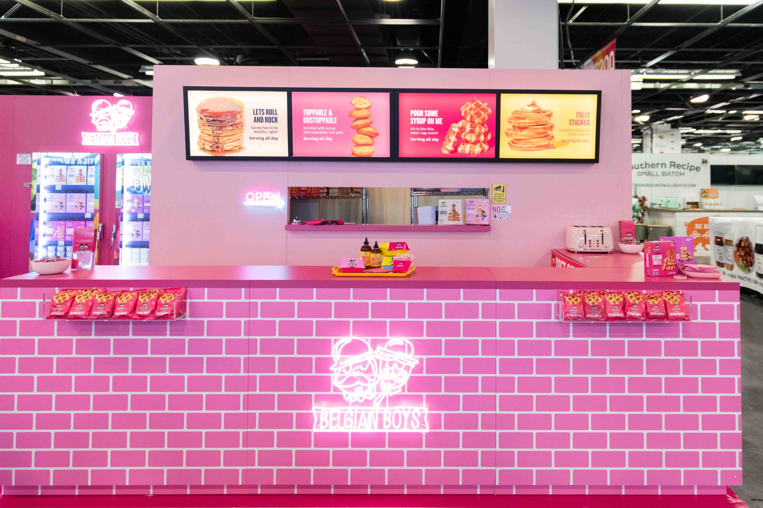
Lighting plays a pivotal role in setting the ambiance of any booth design, especially through neon lighting. Everyday Doze, Steaz, and GTC’s client Belgian Boys expertly leveraged neon to enhance the features of their booths, marking it as a trend that's here to stay.
Backlighting was also a notable trend that accentuated logos. Additionally, canopy lights proved to be a popular choice, ensuring optimal illumination in key areas of the booth.
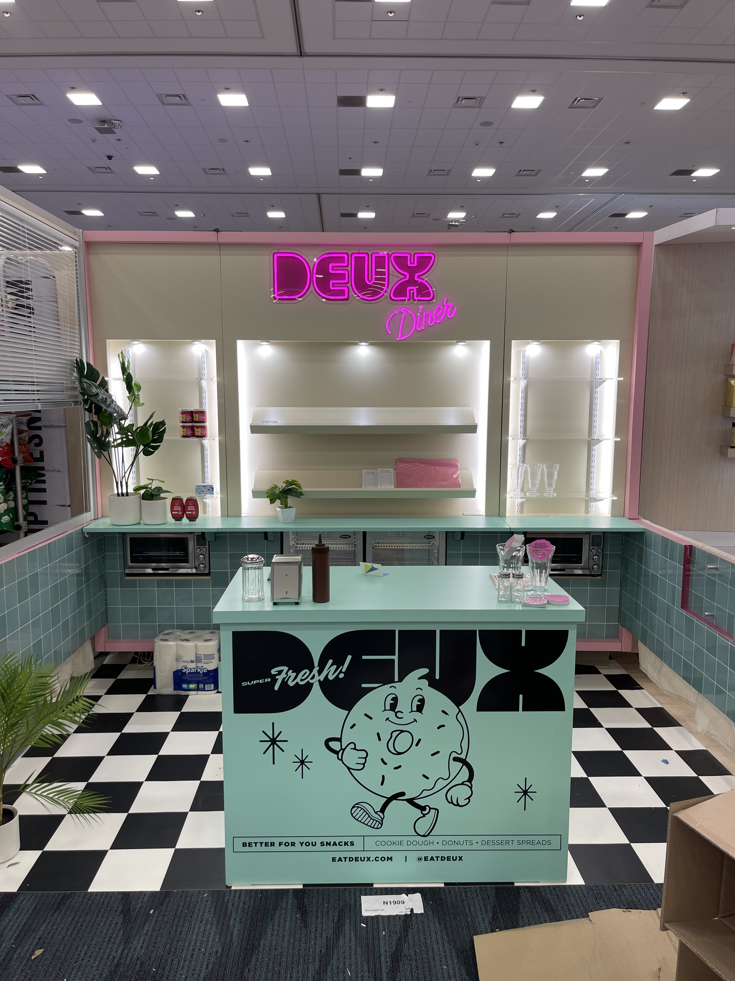
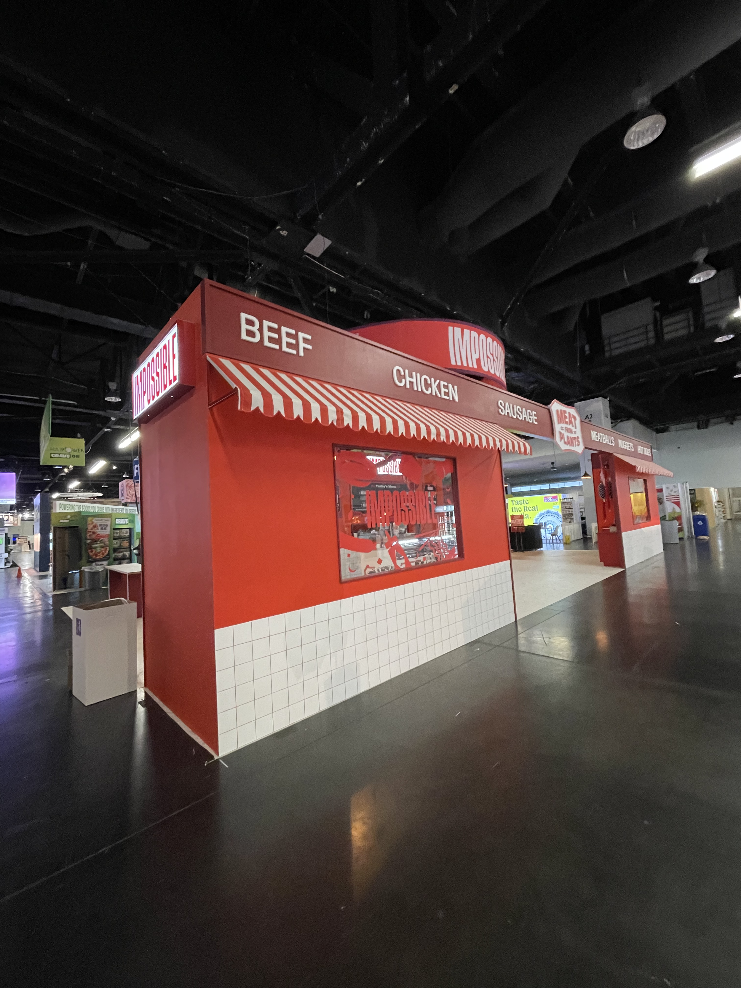
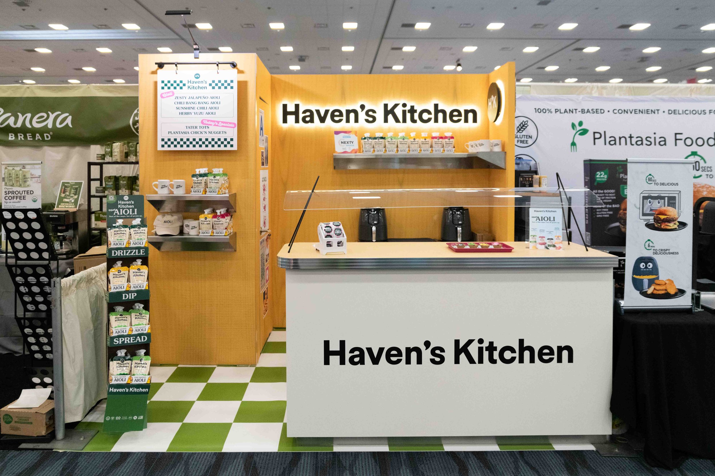
Booth Themes
Thematic booth designs are always a good choice. “Nostalgia” and “Cultural Roots” were two themes that stole the show this year. The Impossible booth leaned into Midwest butcher shop vibes while brands like Deux and GTC Client, Havens Kitchen, leaned into an old-school diner theme.
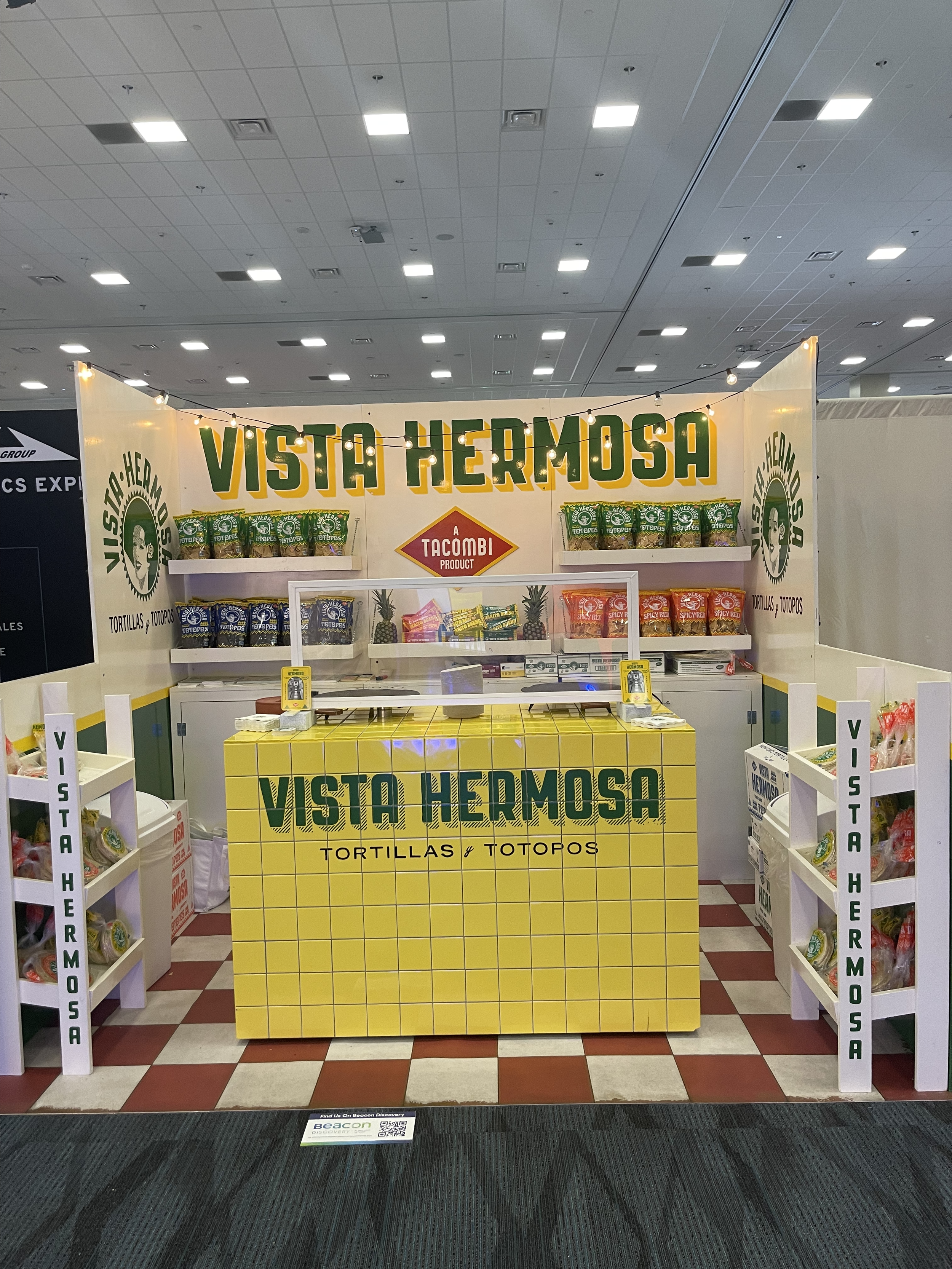
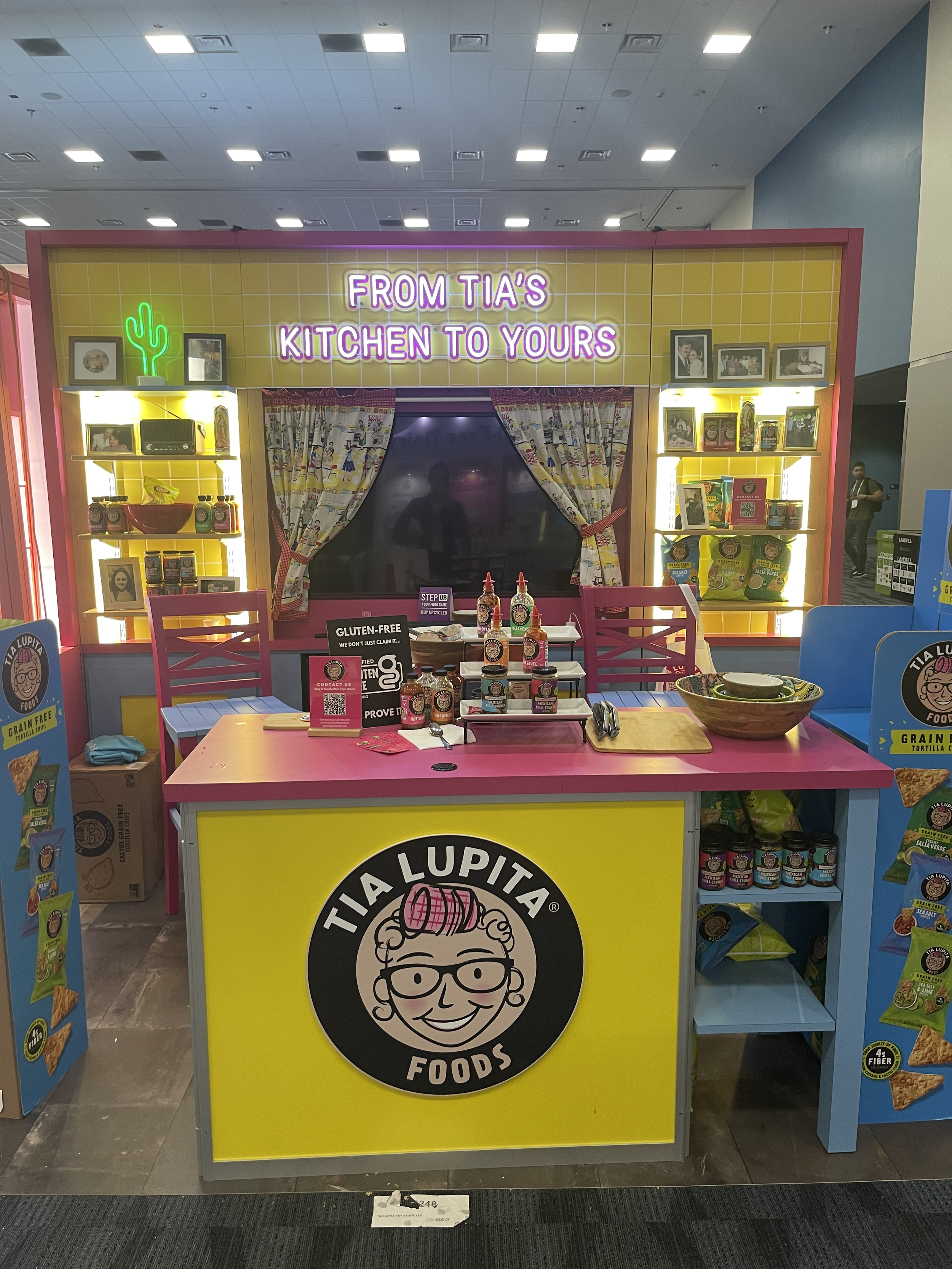
Vista Hermosa and Tia Lupita showcased the traditional roots tied to each brand throughout their booth design, making each feel extremely inviting while clearly communicating each brand’s personality through every fiber of the design.
From the captivating use of materials and finishes to lighting themes, each booth we encountered told a unique story of creativity and brand identity. As a creative agency dedicated to crafting immersive brand experiences, we look forward to continuing to push the boundaries of booth design and empowering brands to leave a lasting impression in the dynamic world of trade shows.
BONUS READ - GTC FAVS

MARISSA - IMPOSSIBLE
“I thought it was a unique use of space and created a feeling of exclusivity that supported the overall immersive feeling of the experience yet still felt open and approachable. As some who grew up outside of Chicago, I really connected with the nostalgic theme of the butcher shop. I loved the staging of merchandise within the space and the attend to detail was top notch!”

Hannah - Poppi
"The iridescent finish and the organic shapes at Poppi's booth were what made it stand out as one of my favorites at Expo West. It was a refreshing contrast to the more traditional setups around it, making Poppi's booth standout for me."

Britt - everyday doze
"The unique use of neon lighting throughout the booth, along with the recessed shelves for their product display, really caught my eye. It was such a cool design choice that made the whole booth feel edgy but inviting."

Kristen - sunsip
"The fluted finish and the "kissing booth" concept were what truly made this booth stand out for me at Expo West. The way they integrated this fun and interactive concept into their booth design really made it memorable.”

MATT - death wish coffee co
"The open floor plan of the booth and the pops of vibrant color against the black finish really caught my attention.”